
Hi friends,
First, a heartfelt thank you to everyone who participated in my original Pride and Prejudice book cover contest here on the Austen Variations blog! I’ll admit—I was a little nervous at first. I worried that either there wouldn’t be enough votes, or that the responses would be so evenly spread out that I’d end up with a tie. Thankfully, that wasn’t the case at all! We had a clear winner, and I’m so grateful to everyone who took the time to share their thoughts.
Now that the winning design has been selected, I’ve been working on a few final refinements—most notably, the title font. While I liked the original, I wanted to explore a few other options. After reviewing dozens of possibilities, I’ve narrowed it down to my top four—and once again, I’d love your input!
Since so many of you offered such thoughtful feedback on the cover, I’d be thrilled to hear what you think about the font options below. And as an added thank you, I’ll be giving away two additional paperback copies of the finished edition once it’s published. 🙂
To enter the giveaway, just leave a comment with your font preference—whether it’s your top pick or (even better!) a full ranking from favorite to least—and you’ll be automatically entered. Winners will be randomly selected from the comments.
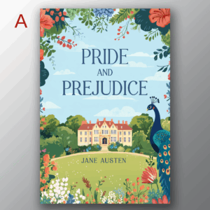
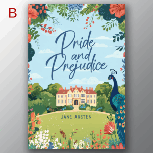
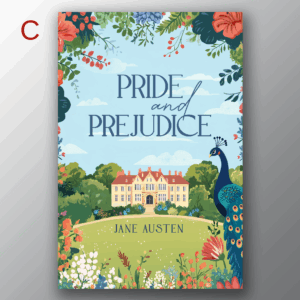
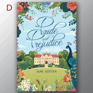
Below, you’ll find the four finalists, labeled A through D in the upper left corner of each design. The cover image is the same in each version—the only difference is the title and author font. Note: I’m currently leaning towards using the author font from Design A regardless of which title font wins, but feel free to weigh in on that too.
So, without further ado—here are the finalists!
Thanks again for being part of this process. 🙂 Your support and enthusiasm mean the world!
With gratitude,
Jennifer Altman
91 comments
Skip to comment form
This is so much fun!
I have to admit, A is my top favorite. It balences out the cutsey artistic aspect of the cover and gives it a dignified feel.
My next vote would be D, because if you’re gonna go full on wowza, that font does it.
C is third, again because of the balance, but the different – and disrupts the eye.
Last is B, goes too far with the cutsey, looking like it’s something a 15yo teenage girl chose.
Author
Thank you so much, Sam! This is great feedback, and I’m so glad you’re enjoying being a part of the process. 🙂
A is my favorite!!
I actually like A first then B, C and D just as they are lined up.
Author
Thank you, Brenda! 🙂
A, C, B, D
Author
Thank you! 🙂
B, C, D, A
B, C, A, D
What a lovely cover design! My ranking from favorite to least favorite: A, C, B, D.
While I like the author font from design A, I would prefer it to be a bit larger and for the author name to be located slightly below where it now sits – perhaps a bit more centered on the lawn between the gravel drive and the tops of the blooms.
I hope you are truly enjoying this creative process! (My Cavapoo is named Miss Darcy!)
B or C
Author
Thanks for your feedback, Michelle!
I prefer B, C, A and lastly D.
Author
Thank you! 🙂
I prefer both the title and author font on Option A — absolutely!
A C B D
Most to least easy to read
Author
Thank you!
Author
Thank you, Susan! This seems to be the trend. 🙂
I prefer font A. It is the most readable and balances the busy-ness of the cover (which I didn’t prefer in the cover-design round). Font C would be last choice: I don’t think the “and” in script works with the rest of the title font.
Author
Thank you, Lois! That’s a really good point about a plain font balancing out the busy-ness of the design. And you seem to be in the majority here!
My ranking: A, B, D, C
I like A best, because it’s the most harmonious balance between font and picture. The space around the font makes Pemberley appear a little more prominent and the straight lines of the font enhance it’s stateliness.
B is nice, but the font is more dominant than the picture and I prefer a little more balance.
D is okay, but the font takes even more space than in B and is too ornate for my taste.
I don’t like C, because when I read the title, somehow the word “and” is emphazised in my mind, which feels completely wrong.
For the author name I also prefer the author font from A for all versions.
D is my vote! Followed by C, B then A! Definitely loving the cover!!
Author
Thank you so much for your detailed feedback, Sabrina! This really helps. A seems to be the clear winner so far. 🙂
These look great!
Title font: C, B, A, D
C: Not too serious while still being easy to read
B: fun and fill the space well. r’s look like n’s.
A: prefer the “and” to be lower case
D: I don’t like the P’s. They look like they’re going to topple over.
Author font: I like C more than A, as it looks better to be a little bigger in the hill space, but A is better than B/D.
Author
Thanks so much, TC! Your comments are extremely helpful. 🙂 I was actually leaning towards C myself, but it looks like the majority are preferring A so far. (Also, I agree about the r’s looking like n’s in design B. I almost eliminated it because of that, but decided to keep it in the running. And that is good feedback about the “and” in design A. I may have my designer play around with that word a bit more. Maybe even substituting and ampersand (&)? We shall see!
I prefer font A as a plain font is more readable when reduced to a thumbnail image.
I use the Kindle app on my phone and when the cover is reduced to 1 inch tall in my book list or library (grid view), fancy fonts become just squiggles.
🙂
Author
That’s a great point, Wendy! Thank you so much for the feedback! A definitely seems to be the favorite so far. 🙂
I like A the best. It is clear and clean for reading.
In order of preference, A, C, B, D.
My reasoning is to be able to see and read it quickly. The dark, plain font is clear and not busy, as the cover is beautiful – and extremely busy. Frilly lettering makes it too busy for me.
Thank you for asking for input!
Author
Thanks so much, Erna! That’s a very good point, and I think you’re right. The simpler fonts balance out the design better. And A seems to be the favorite so far.
It is a tough choice, but I would rank them: A, C, B, D. Clear title, inviting graphics on cover on A. The fancy fonts on B and D may fit the time period, but do not invite me in to read the story as well as the fonts on A or C. Thanks for asking for our opinions!
Author
This is really helpful feedback, Laura! Thank you so much for commenting! It’s already looking like A is going to be the winner. : )
So, my ranking, from favorite to least favorite, is: B, A, C, D. I like B best because it is bolder, more eye-catching but it’s also the most legible. I. An day when young people can’t read cursive, it is fancy but readable. A is simple, legible and doesn’t draw the eye away from the picture. C is legible but still a bit fancy. I agree with another commenterthat the and becomes more emphasized in my mental voice. D is bold, but the cursive could be hard to read, especially in a thumbnail.
My favorite author font is A. It fits who Jane was, a person who did not draw attention to her fame.
Author
Thank you so much for your detailed comments, Rebecca! I was leaning towards C myself, but more than one person has commented that they don’t like the “and” being in a different font as it seems like it’s emphasizing that word, which is really helpful to know. Right now, it looks like A is going to be the winner, but we shall see. 🙂
My favourite is B – then C, A, D.
D seems harder to read, but B is nice and slightly fancier which suits the book!
Author
Thank you so much for the feedback, Pip!
A, C, B, D. I find A is easier on my eyes and fits in well with the cover.
Author
Thank you, Eva! This has been so helpful for me as it seems like A is the clear favorite. 🙂
My fav is Design B.
Author
Thank you!
A. Everything is centered nicely.
Author
Thank you, Leslie! That one definitely seems to be the favorite. 🙂
A expresses the simple dignity due to a novel published 200 years ago that still captivates generation after generation of readers.
My ranking is
D my favorite, like the script look and flow
A clear and crisp but not as much a fan of the block lettering
B nice, bold
C the mix of fonts not my favorite
Author
Thank you, Jennifer! This is very helpful. 🙂
C
D
B
A
That is the order of my preference. I like the cursive, though I admit it might be harder to read at first. But I still think the cursive is clear enough to be legible. The one that only has cursive on the word “and” is a nice mix of both options.
Author
Thank you, Kaidi! That was my top choice, but it looks like the majority like A so far. Stay tuned! 🙂
‘A’ is my favorite.
C, please
Author
Thank you! 🙂
I prefer A.
Author
Thanks for voting, Sheila!
Preferably A, being the cleanest, clearest, sharpest and simplest. Therefore yhe closest to Jane Austen’s style. Otherwise, B..
Author
Thank you, Kate! And great feedback. I think I is looking like the winner. 🙂
B
C
AD
B is my favorite. A little fancy but, still readable. The title font is bolder and fills the space well. However, I like the size of the author font in C.
C would be my next choice. A little fancy but, also very readable.
I don’t care for A or D.. A is sooooooo boring! D is too fancy, too thin, and not as readable.
Good luck!
Author
Thanks so much for your input, Janet! However, it seems like “boring” is what most people like, LOL. I have to say, I wanted something with a little more pizazz, but now I’m coming to realize that the plainer style of A actually complements the design better. And it’s the one that appeals to the majority of voters, so I think that one is going to be the winner.
This has been really fun! Thank you for letting us be a part of your cover design! I look forward to seeing this book in print. Very best wishes to you! 😀
I pick D!! looking forward to reading this book!!
Author
Thanks so much, Char! I hope you enjoy this edition, no matter what font we end up with!
I prefer font A. It feels as “solid” as the image of Pemberley.
Author
Thank you, Linda! You seem to be in the majority with your choice. 🙂
I chose selection ‘A’ because it is straightforward. You’d be surprised at how many people cannot read cursive. I’m not kidding. Many schools have quit teaching cursive, and people cannot read it. Also, the font takes away from the total picture. You have a beautiful design, but don’t want the font to pull attention from the rest of the cover. People will feature more on the typeset font than on the overall design. I hope you have a blessed launch. Good luck on the win.
Author
Thank you! I agree completely. (And you’re not the first person to mention that younger readers can’t read cursive, LOL!). It definitely looks like I’m going to be using font A. 🙂
I think you’re more likely to find young people who want to learn/have learnt cursive reading P&P than the general population, if that makes sense?
I for one didn’t learn cursive at school, just linking (which I think they’re getting rid of where I am), but I got my grandfather to teach me later on.
Also, cursive fonts are generally easier to read than handwritten cursive.
Basically, you could still do cursive
I like the font in “B”
I like B, but I agree that today’s young people don’t read cursive manuscript, so I will go with A.
Author
LOL. Sad but apparently true. 🙁 It looks like it’s going to be A.
I like the title font in D best. It’s artistic and interesting; harder to dismiss. C is my preference for the author font, because it’s larger. Jane Austen’s name deserves a little more importance. Second favorite title font is B.
Author
Thanks for your feedback, Elizabeth!
My ranking from most to least favorite:
B -like that it has some flourish yet still easy to read
C -Has a little flourish
A -like but a bit too straight-forward
D -find a bit too much flourish for my taste
Ultimately they all look nice though so I don’t think you can go wrong with any of them.
Author
Thanks so much for commenting! 🙂
A due to the simplicity of being able to read the title even if it is a small thumbprint on my phone kindle. I like the other fonts if it was a paperback but for an ebook the easier to read the title the better
Author
Thank you for your feedback, Glory! 🙂
I’d also say Authors Font A, but Title Font B
Author
Thank you! 🙂
B
Font B
The words pride and prejudice are linked at the first letter… The book is all about the one leading to the other…
It is apt.
Font D is also linked but very light..
Therefore B is a better choice
Font B
Font B
cursive always seems more friendly and fun..
and
Could be a naive way of putting it
but the words pride and prejudice are linked at the first letter… The book is all about the one leading to the other…
It is apt.
Font D is also linked but very light..
I prefer B, the script is pretty and easy to read.
I’m looking forward to the book – as I usually read all of yours when released.
Thank you you sharing
C looks cool. The stress on the “and” is essential to the story. There is pride and prejudice in both parties, which lead to misunderstandings. I would vote for C.
My votes are B, C, D then A.
A is my fav.
I like B, D, C, A in that order
My vote is A, C, B, D. Thank you for allowing us to participate like this!
I vote A, C, D, B…. From favorite to least.
D: I like the sizing of the font and how it fills the space well.
C: I like the florid of the “and” and how easy it is to read.
Probably to late, but A and B are my favorites.
C for ne with Jane Austen larger.
C for me with Jane Austen larger.
1st-C…I like the clean, sharp edge font of pride/prejudice with the “and” a different font
2nd-B
3rd-A
4th-D
C is my favorite!!
I like the clean, easy to read font of pride/prejudice with the “and” a different font
I vote for A, but would rank A > C > B > D