
 Hi friends!
I’m so happy to be back on the blog today with something a little different. 🙂 Behind the scenes, I’ve been working on a bit of a passion project, and today, I get to share it with you!
I’m preparing to publish a brand-new edition of Jane Austen’s Pride and Prejudice—and I could not be more excited. This is a project I’ve been thinking about for quite a while, and I finally decided there’s no time like the present to make it happen.
Now, I know there are countless editions of Pride and Prejudice already out in the world. But I also know that for many readers, especially those coming to Austen for the first time, classic literature can feel a bit intimidating. That’s why I’ve set out to create an edition that feels welcoming, beautiful, and accessible to a modern reader—while still preserving every word of Austen’s original 1813 text.
In addition to the unabridged novel, this edition will feature bonus materials to help readers engage more deeply with the story. These will include:
- An alphabetized glossary of Regency terms and expressions
- A list of character descriptions
- Fun and insightful facts about Jane Austen
- Historical and cultural context
- A curated list of favorite quotes
- And more!
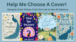
But before I can finalize things, there’s one key piece I need your help with—the cover!
To give myself a range of possibilities, I decided to run a cover design contest. I’ve now narrowed down the finalists, and I’d love for you to help me choose the winner. Here’s how it works:
🗳️ How to Vote:
Click the link below to view all of the finalist covers and cast your vote(s).
👉 Pride and Prejudice Book Cover Contest! CLICK HERE
Please note: the designs are not yet final, so your comments and suggestions—about the colors, fonts, style, or anything else—are very welcome and may influence the final version.
And more good news: To thank you for helping me with this decision, I’ll be giving away three paperback copies of the finished edition once it’s published! The giveaway is open to all U.S. residents and winners will be chosen at random from the comment section of this post.
📚To Enter the Giveaway:
- Click the link above and vote for your favorite cover(s).
- Leave a comment on this blog post with the number of your favorite cover, which you’ll find right above each design. (Example: #274).
- Tell me what you love about the cover(s) you chose: What caught your eye? What about that particular cover would make you want to read the novel for the first time, or add it to your collection?
That’s it! Your input means the world to me, and I truly can’t wait to see which designs resonate most with you.
Thank you so much for taking the time to vote, comment, and celebrate this new edition of Pride and Prejudice with me. 🙂
With heartfelt gratitude and excitement,
Jennifer Altman
52 comments
Skip to comment form
261
fresh, not a too similar to others on the market, still a classic look, keeps the peacock, nice font, home is front and approachable, grass has a sprinkling of flowers which looks livelier
Author
Thanks so much for voting, Denise! This one seems to be the favorite so far. 🙂
What an exciting project.
The two covers I chose were for their layout and color balance. I liked how the eye was moved towards the focal point. (either title or the house)
Both spoke out as dynamic to me and eye-catching.
Sam
Author
Thanks so much for voting, Sam! 🙂
After going through each lovely cover there weren’t many that stood out as much as these three. Each had their mini flaws and even the ones I like best had a bit of something that could be changed to fir the eyes of new readers and those who would get pulled towards the book by the cover. The first that caught my attention is the vibrant and bold colors of #274 which is beautiful and lovely illustrations. The issue would be a change of the peacock, especially the tail could make it appear nicer. The second fave #46 by RjDezynes. The color background that beautiful long peacock tail and peacock location it just all works. Brings Spring and a lovely feeling when looking at the cover.. that was one I didn’t have much of a problem with the cover, it felt right. The third that I liked was the # 211 which reminds me of a decorative mirroring design. The colors are perfect on white background and don’t feel washed out or faded by any other hues. The designs are perfect without looking sad or gloomy. It feels simple and festive in some ways. I think there could be more colors like purple to bring a bit more vibrance to the cover to help draw in more readers, but still very nice.
They were the three that I felt we’re as close to being a greet option, while my second choice, #46 felt it had everything, even if not totally bright, but classic with a little more color flair and illustrations that really work! 💜
Author
Thanks so much for your detailed reply! This is all really helpful feedback. 🙂
I preferred number 261. I loved the over all design, the balance, the bolder colors, the style of the house, and the placement as well as the larger size of the peacock. However, I prefer the title font from number 92.
I did not choose number 92 because I did not like the colors, or flowers of 92 as well, and I really did not like the placement of the peacock. Too close to Jane Austen’s name and it just looks like it’s out of place, sticking out like a sore thumb.
Author
Thank you so much for the detailed feedback! #261 seems to be the favorite so far. 🙂 As I said, the designs aren’t final, so I can absolutely have the designer change the font or the colors, etc. if this is the winning cover. Which is why these comments are so helpful!
Hello Jennifer!
I also meant to add that I like Jane’s name being a bit larger and stacked as in number 92.
Best wishes on your choice!
I was immediately drawn to the blue covers, but I really liked the contrast with the brighter oranges. I almost voted for the one that is currently ranked #1 but realized I like the whimsical lettering of #92 better if I was going to purchase a copy for the cover alone. I knew immediately that I would choose one with Pemberley on the front!
Author
Thank you so much, Koren! This is really helpful feedback. Since none of the designs are final, I can definitely still have the designer change the fonts or colors. 🙂
very interesting idea! my top 3 covers were 46, 183, 261, as I liked the colors, balance and not too busy, less is more. I also liked the idea of the purple one but maybe in pastels instead of such bold bright colors. Also just wondering why peacocks? In the recent Chawton House newsletter they pictured a P&P book with a peacock on the cover. Just found that a coincident.
Author
Thank you so much for your input! I like #46 a lot. But it seems like #261 is the clear favorite so far.
And to answer your question about “why peacocks,” I think there are a few reasons. If you look at past Pride and Prejudice book covers, you’ll see that peacocks are commonly used in the design. I think it started because peacocks are known to symbolize beauty, pride, and vanity due to their showy tail feathers, which echo the themes of the novel. But it seems to have all started with the famous 1894 “Peacock Edition” of the book. Its ornate gold-stamped peacock cover became instantly recognizable and is now considered one of the most beautiful editions ever produced. This edition helped cement the peacock as an aesthetic and thematic symbol tied to the book, so I wanted to include it on my cover as well. 🙂
For me its a tie between 261 and 92. I just can’t decide which font I like better. I love that both these covers incorporate a lot of symbolism as both have a view of Pemberly to represent Darcy, the iconic peacock to represent Jane Austen, and a nod towards nature for Lizzy. Though these two are my favorites they are all great covers!
Author
Thanks so much, Jessica! #261/#92 definitely seem to be the favorites. 🙂 The feedback is very helpful, and if this cover wins, I can definitely combine the best elements of each design.
My favorite was #46, although I thought they were all beautiful and appropriate. I felt like that was not too busy, which can make a novel seem silly before you ever crack a page. I look forward to your version as I frequently recommend P&P to others. It boggles the mind of JAFF readers, but it is surprising how many (especially young) people say, “I think I’ve heard of that book.” Even worse to my mind is when they say, “Yes! I watched that movie with Keira Knightly.” NOT the same! Now I can point to your version. 🙂
I feel exactly the same! A friend recently thought I would be so excited by the reshowing of the 2005 P&P movie. I looked at her and asked, “Do you even know me?! It’s 1995 or nothing!” But I wish more people knew of it from the book, not that horrid movie adaptation.
Author
LOL! Well, I guess we should just be happy that there are enough versions of the book and movie out there for everyone to find one they love. 🙂
Author
Thank you, Valerie! I liked #46 a lot myself… but it seems like #261 is the favorite so far. I hope you get to read this edition and that you enjoy it, whatever cover I end up with. 🙂
So many of the cover choices are esthetically pleasing and harmonious, And some have only small, subtle changes from other choices. On how many may we vote or comment?
Author
Hi Adelle! Please vote on as many as you like! You can give each of them from 1 to 5 stars, but the comments are also really helpful. I will still be able to make changes to the winning design, so if I see people like the colors from one and the font from another, I can update to combine the best of the different versions. 🙂
I liked #61 (https://99designs.com/book-cover-design/contests/stand-out-book-cover-jane-austen-classic-novel-1319937/entries/61)
It made me think of a sampler from that time period.
Some of the colors and the buildings on the others seem too modern for my taste.
Author
Thanks so much, Linda! I like #61 a lot myself. 🙂
For me it’s a tie between 261 and 92. I just can’t decide which font I like better. I love how these covers have a lot of symbolism – Pemberly to represent Darcy, the peacock to represent Jane Austen, and a nod towards nature for Lizzy. All beautiful covers!
Author
Thank you so much! That cover definitely seems to be the winner so far. : )
I like the one with the smallest peacock and the building looking more setback behind the rounded hill. It looks more period and contextual. I wonder about the plethora of peacocks. I don’t remember reading about them in the book at all. In fact, it made me think of the Malfoys of Harry Potter fame. Their manor in Wiltshire is supposed to have pure white peacocks.
Author
Thanks so much, Kelley! That one seems to be the favorite so far.
As to “why peacocks,” I had someone else ask me the same question above. Here’s the reason:
If you look at past Pride and Prejudice book covers, you’ll see that peacocks are commonly used in the design. I think it started because peacocks are known to symbolize beauty, pride, and vanity due to their showy tail feathers, which echo the themes of the novel. But it seems to have all started with the famous 1894 “Peacock Edition” of the book. Its ornate gold-stamped peacock cover became instantly recognizable and is now considered one of the most beautiful editions ever produced. This edition helped cement the peacock as an aesthetic and thematic symbol tied to the book, so I wanted to include it on my cover as well. 🙂
I love #211! Because it includes the house but it also has Regency style, I think it conveys the themes well but will attract a modern audience. I am thinking that I would buy your edition for my teenage son to read his senior year of high school for British Literature. I like that you have included so much. I would also probably use it to help me teach.
Author
Thanks so much for voting, Rebecca! I like that one a lot, too. However, I think it might not stand out as much as some of the others. I hope you like the finished edition, even if it ends up having a different cover from the one you voted for. If you have any suggestions for things to include inside, please let me know! My aim is to provide context to make the story more accessible to a modern reader (especially teens and young adults) so any and all feedback is welcome!
Cool idea. Given that you want this book to more accessible to people who might not think they want to read an old book, the cover should be light and fun. I love #92. It’s beautiful. If another cover is chosen, many of which are also beautiful, I would just suggest a more fun font. I was concerned that given cursive is barely taught anymore, can most people still read this? Honest question. It is very clear to us, but would they confused by the r’s, at least? Even though I taught my kids cursive, they have trouble reading their grandma’s clear cursive letters to them. Because of this, I almost chose #261, but I wonder if there is a font between the two that is perfectly readable but also more fun than 261. Also, I prefer JANE AUSTEN to be a little bigger, like in 92. Final choice, though, #92.
Author
Thanks so much for your feedback! It’s definitely looking like that design is going to be the winner (whether it’s #92 or $261, or some combination of the two). And I definitely agree with you about the font. It’s a fine line between creating something that’s unique and interesting but making sure it’s still easy to read. So, my guess is the font will be something different from either of those covers if this design is chosen.
#72 is my favorite by far:
The font and the design are perfect for a timeless classic like P&P.
I also like #46, even though it looks a little old fashioned.
#92:
I like the artwork, but the font of the title not at all.
#199 and #211:
I like the peacocks, the text and the house, but there are far too many flowers, especially near the text.
Author
Thanks so much for your feedback, Sabrina!
#261 came up as top ranked right after I voted so I guess I’m going with the popular vote! But I like the color scheme and the little peacock homage. As others have said, the font is plain, but legible! I like a swoopy cursive font as much as the next person, but sometimes the line is too thin or the letters too bouncy and it’s difficult to read. I would prefer legible and easily identifiable to “squint and guess but it’s pretty!” If something can be found that is a little more aesthetic I’d be down for it!
Author
Thanks so much, Aimee! If I go with this design, I’m going to try to find a middle ground for the font (a little more interesting but still easy to read). 🙂 Thank you for your feedback!
I voted for #261. I like the colors and that Pemberley is featured in the center with the peacock/flower design on edges. I also like the font is easily readable and that it isn’t as busy as some of the others.
Author
Thanks so much for your feedback! It definitely looks like that design is going to be the winner. 🙂
183: is the one I gave 5 stars too.. I like that it has a vintage look to it, but with modern colors.
157: Was the second one I liked best. Again, the colors and design is what I like.
I like #92, but with the title font from #261. Thanks for allowing us to have a peek!
Author
Thank you for your feedback, Robin! 🙂
#46 gave more original feel but I rated all of them based on how they made me think of the book cover
Author
Thanks so much for voting, Glory! 🙂
I chose #261. Right away the title font caught my attention – very clear. And the way the flowers and peacock are arranged around the cover made me feel like I was looking through the hedgerows at the house in the distance – very inviting – calling me to come , visit the house and read the story. Colors were not too bold and not too soft – just right. Thanks for asking for our input!
Thanks so much for your feedback, Laura! It looks like that design is going to be the winner!
#9 Brandkore; white background
Thank you for your vote, Patty!
#53
I love this one of the majestic looking manor house. It looks like somewhere Darcy could live and Elizabeth would surely gasp at such a marvelous structure. The pretty gold accents on the building caught my eye. The cover would inspire some many lovely visuals of Darcy and Elizabeth at Pemberley. It just looks like it holds so many treasures , the book and this particular cover.
Thanks so much for your input, Monica! 🙂
I voted for #6, I like the flowers and blue color scheme. I do not understand the peacock though
Thanks, Anna! Here’s my reply about the peacocks. 🙂
If you look at past Pride and Prejudice book covers, you’ll see that peacocks are commonly used in the design. I think it started because peacocks are known to symbolize beauty, pride, and vanity due to their showy tail feathers, which echo the themes of the novel. But it seems to have all started with the famous 1894 “Peacock Edition” of the book. Its ornate gold-stamped peacock cover became instantly recognizable and is now considered one of the most beautiful editions ever produced. This edition helped cement the peacock as an aesthetic and thematic symbol tied to the book, so I wanted to include it on my cover as well. 🙂
Sorry, forgot to get the number and was not allowed to return to the vote page. It is the one from Brandkore with the partial peacock! See my comments where we voted. KH
Thank you, Kate! That design seems to be the clear winner. 🙂